

How colors are used in your home may affect you more than you realized. It’s been well established that colors affect the human experience. From the color red making people hungry, to yellow making babies cry, and green increasing our feelings of calm and health, there are many documented human responses to color.
Why Does This Matter in Your Home?
Everyone wants their home to feel good to them. Some people want their entire home to feel calm and welcoming. Others would like their home office to feel vibrant and alive. Some hope to create great socializing environments for entertaining. All of these things can happen with the help of color.
You’re Already Being Affected by Color
What you may not have considered is that without making conscious color choices, you are still being influenced by the colors in your home. Colors have power, and they may be creating something other than the emotions you’d hoped to have at home.
You may want a cozy, restful bedroom but have a bright rainbow of colors in your bedding and decor, keeping your body and mind from settling down at night. Or you may want to have friends over for a lively night of games and fun, but your monochromatic beige living space sets the scene for a quiet, almost professional gathering instead. You want the family to gather for great meals in the dining room, and the calm blues you’ve chosen influence the group to lose their appetite before they’ve even started.

Before You Start: Color Terms to Know
Tint: A tint is what you get when adding white to a color. Pink is a tint of red, because white has been added.
Shade: A shade is what you get when adding black to a color. Few shade have their own names
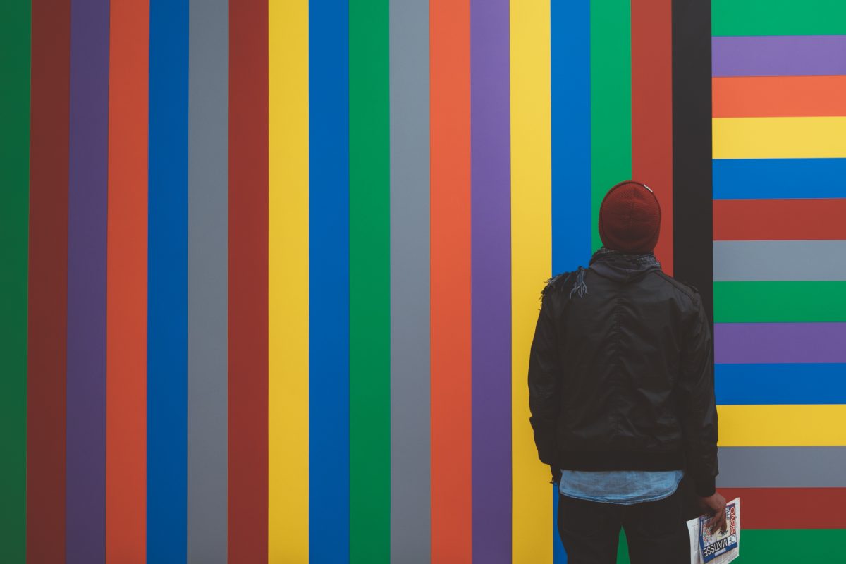
Hue: Hues are variations of a color created by adding another color. Generally we describe the color added as a primary color. Teal is a hue of green, because blue is added.
Monochromatic: Monochromatic means “one color” and it refers to decor that is primarily tints and shades of the same color, but may include hues. The key is that notably different colors are absent.
Duochromatic: Duochramatic means “two color” and is a clean but lively look. There are two prominent colors, to the exclusion of others.
Accent Color: An accent color is used sparingly, and is generally very different than the other colors in use, it stands out.
Neutral: A neutral color is one that goes with everything, or fits in well anywhere. Black, white and grey are always neutral, and most people agree that beige, tan, and brown can also be neutrals.
Primary Colors: Red, Blue, Yellow. They are the simplest, most basic colors. All others come from mixing these three.
Secondary Colors: Green, Violet, Orange. These are the equal-part mixes you can make from each pairing of primary colors. They’re still bright and basic, and do well used with primary colors.
How Can You Use Interior Colors Most Effectively?
Knowing the amazing power of color, you may feel the urge to repaint, reupholster, and refinish your whole home. That’s entirely understandable, and doing so would indeed have a great effect on your home and homelife. The question is, how do you choose colors?
There is a lot of color psychology and color theory information out there on the internet, but the truth is that harnessing the power of color takes years to master. Choosing colors is not as straightforward is it seems. You must consider intensity of the color, scale or size of the piece, patterns and textures, ratios of colors present, and the effects of where you place the color. As you can imagine, having a black floor will affect you very differently than having a black ceiling would. A professional interior designer on your side can save you from a lot of pitfalls.

Things to avoid:
- When looking at paint chips or color samples, bright colors will seem more reasonable in that small form than they would be on a large item. That sorbet orange that looked invigorating on a 2-inch by 3-inch paper card is actually blazingly bright on an entire wall. The larger the space you intend to paint or item you intend to reupholster, the more you need to look to tints, or possibly shades. Because of this, a bright color on a wall will generally look much less exciting on a paint sample card.
- Be mindful with patterns. Having too few patterns or interesting textures can create a more sterile look than intended, whereas having too many patterns can create feelings of chaos or messiness.
- It’s not generally a good idea to decorate in all primary or secondary colors. Try to include more complex hues, like dark, rich colors or light, dusty ones.
Orchestrating the interior colors in your home to help create the life you want is something that takes skill and knowledge. And it’s not difficult with the right help. If you have a home decorating or remodeling project coming up and need some guidance on how to use colors to your advantage, contact Robineve Interiors.